Pressing de Lyon: From Brand Strategy to Website Development
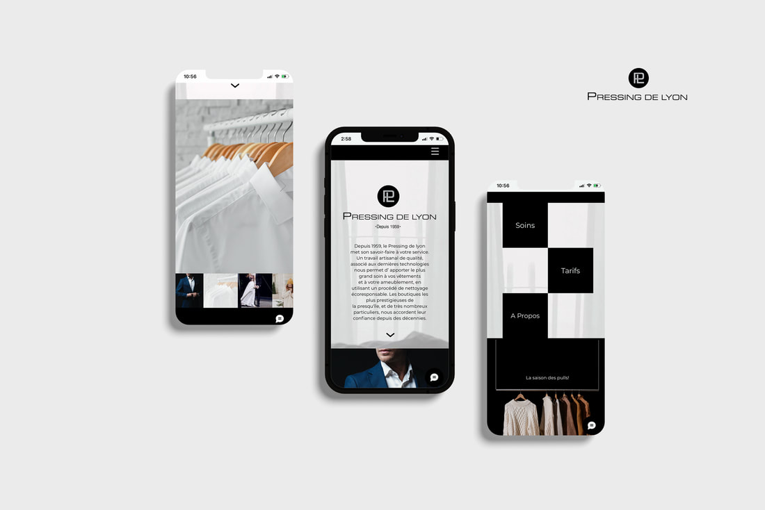
The project involved building a brand strategy and expanding the existing identity to align with the company’s digital presence. The website was created on the Wix platform, with wireframes and UI design developed in Figma. Creative code in JS/CSS/HTML was integrated into some sections to add subtle animation effects and interactivity where needed, enhancing the overall user experience.
A Refined Digital Identity for a Premium Dry Cleaning Service
Strategy and Design Tailored to an Upscale Market
Through our strategy and research, we identified that the primary audience for Pressing de Lyon's services includes high-net-worth individuals, such as business owners, lawyers, surgeons, fashion designers, as well as busy professionals like working mothers. This understanding led us to adopt a refined approach for the website’s design, aligning with the expectations of this specific market.
The brand identity was expanded to reflect the premium nature of the services. The existing logo evolved into a cohesive, elegant identity, perfectly suited for the website and digital platforms. The color palette features a modern monotone scheme, with black, grey, and white tones to convey class and sophistication. Design elements, including minimalist buttons, clean typography, and sleek card hovers, create a user experience that is both refined and accessible.


UI Design and Digital Collage Developed in Figma
A Modern, Engaging User Experience for Pressing de Lyon
The art direction for Pressing de Lyon centers around a dynamic digital collage, where various fabrics, garments, and household items come to life through subtle animations. This creative approach highlights the range of services offered while keeping the visual flow engaging and modern.
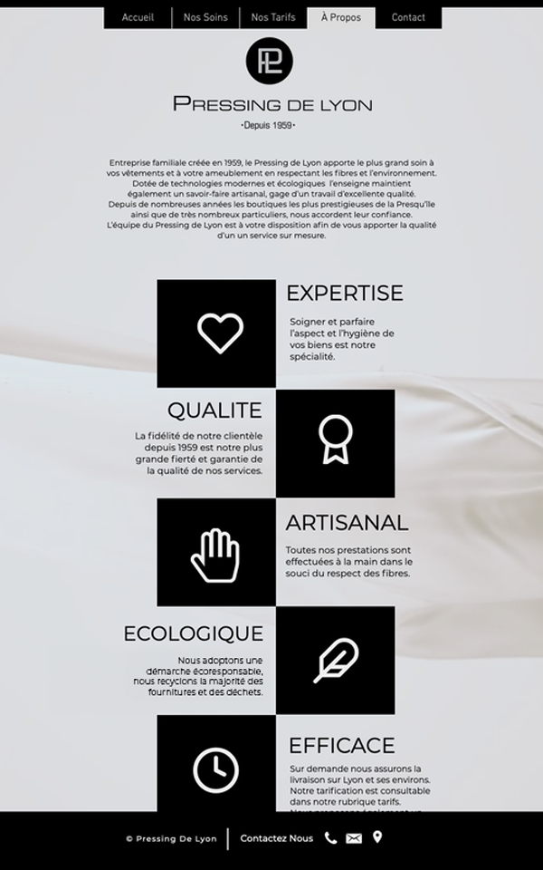
The website's UI design further supports this refined approach, with each page crafted for clarity and ease of navigation. The "Nos Soins" page organizes categories like wedding dresses, delicate garments, and designer wear in a visually appealing grid, offering a seamless experience for users to explore services. The "À Propos" page maintains a professional and approachable tone, emphasizing the brand's heritage and values through clean, minimalist layouts. Across all pages, the use of a monochromatic color palette, minimalist typography, and interactive card hovers ensures a consistent, upscale feel, creating a user-friendly yet sophisticated interface.


